In an article entitled “Here’s How Higher Education Dies,” education reporter for The Atlantic Adam Harris describes the decline of higher education. As Harris notes, the schools that will be safe from the eventual bursting of the academic bubble will be “the major players and media darlings such as Ivy League institutions and major public institutions like the University of Texas at Austin”—schools like Penn. With vicious marketing strategies and airtight branding techniques, these institutions transform themselves into “media darlings," corporate megaliths insured against the whims of the higher education landscape. With a $12.2 billion endowment as of 2017, the University of Pennsylvania functions more and more like a business with a mission to stay on top.
Its enormous economic power means that it can actively shape the region around it. With around 39,000 local employees, Penn is now the largest employer in the Philadelphia region. It's come a long way from the days of Benjamin Franklin. Now, with competitive rankings to obsess over and pressing need to attract global talent, the university needs a unified brand presence.
But this wasn’t always the case. “Ben Franklin named Penn at a time when there was no search engine optimization,” says Kathryn Bezella, Director of Marketing and Communications at Undergraduate Admissions.

Until the Quad was built in 1895, Penn was a commuter school, and most of its students came from the Philadelphia area. It provided scholarships to Philadelphia public schools and its library was free to the public. Its urban location was also core to the university’s identity—historian Francis Newton Thorpe, in the July 1895 issue of Harper’s Magazine, wrote that “Pennsylvania was the first American University planted in a large city. Its relations to Philadelphia, scientifically, socially, and as a power for culture, constitute perhaps its highest immediate influence.” Perhaps because of this, Penn sought to be innovative and modern from the beginning.
With that commitment to a modern image also came an adherence to vocational education—a focus on the new and practical. In a 1749 pamphlet about the education of youth in Pennsylvania, Benjamin Franklin advocated for modern languages like French, Italian, and Spanish because they were the “tongues of commerce” and wanted to exclude more traditional languages in academia such as Greek and Latin. According to Thorpe, scientific courses were “undoubtedly valued as avenues to gainful occupation” at Penn as opposed to at Yale, where there was more of a focus on classical studies. Thorpe attributed Penn’s focus on pre–professionalism to its geographic location, as many people in the Pennsylvania region worked in manufacturing, business, mining, transportation, building, and engineering.
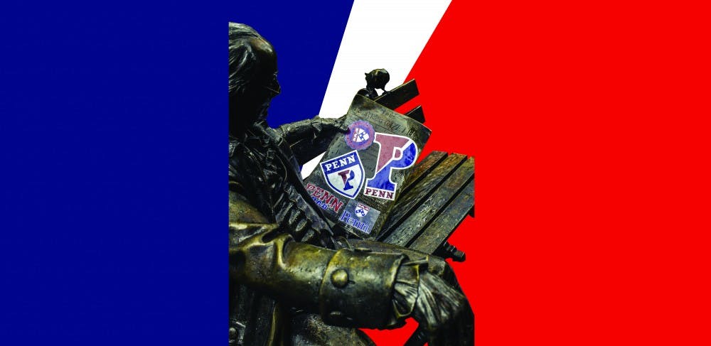
Although Penn certainly started to develop its identity in its early years, it was almost two centuries away from even resembling Penn's brand today. Penn didn’t have any sort of logo until as late as 1933, when a design combining the dolphin from Benjamin Franklin’s shield and the chevron and plates from the Penn family’s shield was adopted by the university. The shield gives the university a face and makes the Penn brand instantly recognizable. The university’s Logo Style Guide states that the shield “is a way to identify the University as part of the ‘Ivy League.’” Use of the Penn logo and brand is now regulated by University Communications, which determines which typefaces and colors should be used with the university shield. Communications also provides templates of Penn–branded stationery including business cards, letterheads, and envelopes.

The red and the blue don’t date back to Penn’s founding either, but to a track meet in Saratoga, NY in 1874. According to a 1965 booklet from the Office of the Secretary, the captain of the track team was asked which colors Penn would be wearing, and replied, “We’re going to be wearing the colors of the teams we beat,” referring to the Harvard crimson and the Yale blue.
Even after Penn settled on its shield and colors, their use went unregulated for a long time. This led to haphazard representations of the University, with its 12 schools all using slightly different typefaces, colors, and versions of the shield. Proof of these outdated logos and brands isn’t accessible online and exists only in the form of printouts on computer paper. As he hands them over, Associate Vice President of Business Services Christopher Bradie says lightheartedly, “The University Archives might not have copies of the old school logos because we might’ve tried to burn all of them.” At one point, Wharton used yellow while the Dental School used purple. Engineering used a version of the shield with the two books and the dolphin shorn off. Unlicensed retailers sold Penn merchandise with different shields on them. An Office of the Secretary booklet published in October 1965 declared, “Embellishments such as stylized leaves may surround the shield, dignity and good taste being the best tests of appropriateness.”
But then came the digital era. “With the emergence of the modern web and the rise of digital advertising, the Business Services Division decided it was time for a standardized look,” says Bradie. “We had a lot of conversations about the brand identity of the university [...] We wanted to make a logo that will allow different representations of individual schools but still have some cohesiveness.”

Admissions felt the need to standardize the Penn brand as well. As universities eventually grew into merchants of higher education, colleges began competitively marketing themselves to prospective students. “It really became necessary for us to have a cohesive look, feel, and message, because how else would you ever cut through the noise?” says Bezella.
The Business Services Division set out to standardize the Penn brand in the fall of 2002. The university website now has a page dedicated to outlining its branding standards, explaining that the official Penn logo consists of three elements: the shield, the stylized word “Penn,” and the “University of Pennsylvania” logotype.

It was also around 2002 that Business Services added a white wedge to the “split P” Penn Athletics logo to make it look more modern, a quality Penn has identified with from the beginning. With the redesigning of the central Penn website in 2015, the University also released web style guidelines to standardize its online presence.

The university licenses the use of its name and logo to various companies like Champion, Nike, and Tervis. Bradie says that after the university laid down its rules for use of the Penn brand, many unlicensed retailers stopped selling Penn brand merchandise. The University has also cultivated other economic ties to its brand. Shop Penn, a project by Penn to publicize the retail offerings on campus, is essentially an advertisement for University City.
With powerful visual tools under its belt, the Penn brand now reinforces its centuries–old identity through more modern approaches. The admissions office doesn’t lead with the word “liberal arts” when pitching Penn to prospective students anymore. Bezella says that her team stopped using the term because it doesn’t resonate with their Generation Z audience. Her team is charged with identifying ways to adapt Penn’s reputation to entice prospective students, and currently the word her team focuses on is “interdisciplinary.” Not only does Penn have to cater to a younger audience, but it also has to look to a global one. “I’m leaving for Kathmandu next Wednesday. When I stand in front of a Nepalese audience and say “Benjamin Franklin,” what will that mean to them? We needed to reframe Ben Franklin from a founding father to an intellectually curious polymath who wanted to solve the problems in his world,” Bezella explains. She feels that practical approaches to tangible problems is something that resonates around the world while also being a core part of Penn’s identity.
Thorpe saw Penn’s decision to move from Old City to West Philadelphia after the Civil War as a sign of constructive energy. Today, Penn’s relationship with Philadelphia and more specifically, the communities surrounding the school are fostered with the school’s image in mind. “We’re proud of being in West Philadelphia. The university does a lot to engage with the city,” says Stephen MacCarthy, Vice President of University Communications.
Although the Penn brand may now use modern tools to help define its identity, its core values hail from the old days of highballs and rowbottoms. “That’s how you know you have a strong brand that’s real,” Bradie says, “when you can look at today’s implementations and connect them historically.”