Everything is ephemeral. Nothing stays the same. As college students, we’re no strangers to phases of drastic reinvention, be it through choppy bangs, Splat hair dye, or a new nickname. For many of us, we’re trying to find ourselves and be who we believe we ought to be. These aesthetic changes are experiments in establishing identity during a seismic period of our lives.
Well–established brands across the nation seem to be undergoing the same identity crises. Rebrands are almost always controversial, especially when staples of our lives undergo them. For example, this August, Cracker Barrel revealed a new logo. The company had diluted their image with an uncharismatic lettermark, a bloated reimagination of their previous logo. Despite it being quickly rolled back, the damage was already done—the overhaul triggered a culture war frenzy and warranted public statements and backpedaling from the company’s CEO just this week, nearly two months after the fact. Beyond Cracker Barrel, we’ve seen this kind of ill–advised transformation time and time again, from Apple’s shocking user interface redesigns to the decades–long trend of companies needlessly oversimplifying their logos.
Admittedly, much of this outrage is unwarranted. We are all resistant to change at first, but we eventually come around to initially unpopular creative choices. In the case of the newly renamed Philadelphia Art Museum, however, one age-old adage comes to mind: “if it ain’t broke, don’t fix it.”
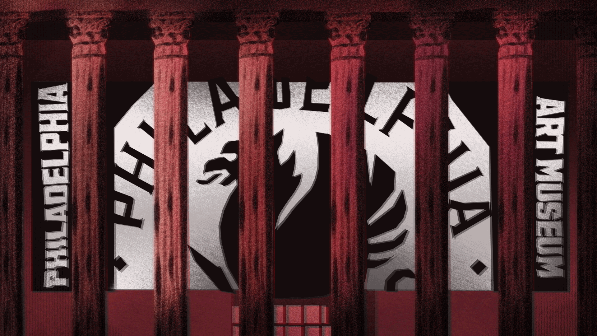
My disdain for the redesign began as a knee–jerk reaction to the jarring creative direction of the new logo. Upon further reading, it’s clear that it drew inspiration from the museum’s 1938 version and griffin architectural motifs. Its execution, however, fails to honor that history, instead speaking the design language of tacky millennial–run craft breweries. I’m far from alone in this opinion, if the incredulous commenters across PhAM’s 11 (and counting) Instagram posts defending their rebrand count for anything.
The more I learned about the rebrand, the more puzzled I became. The rebrand brings in not only a controversial logo, but a modernized typography across all signage, friendlier museum guard uniforms, and overall more hip programming, including a DJ–in–residence. It all begs the crucial questions—why? And who is this for?
And then there’s the ridiculous rename. Sasha Suda, PhAM’s CEO and museum director, explained that when she refers to “the PMA” around folks unengaged with the Philadelphia arts scene, “they have no idea what I’m talking about.” I struggle to understand why that would warrant a complete name change. In my nearly four years at Penn, never once have I known the museum as anything but the PMA. And while it may be the case that people uninterested in museum–going are unfamiliar with the acronym, there’s no reason that PhAM (pronounced “fam,” presumably) would fare any better. This decision has confused the museum’s current audience at best and enraged them at worst. Worse yet, it creates a new search engine optimization problem—the museum is now competing for clicks with the fourth–most common Vietnamese surname. Many of the museum’s followers were quick to enumerate the many other plausible, ill–thought–out acronyms the rebrand introduces, from the even less SEO–friendly “PAM” to the even more ridiculous “PhArt Museum.”
Looking at PhAM in the larger world of corporate rebrands, it’s important to understand why companies choose to engage in rebrands in this way. Every design consultant and creative team knows to expect this sort of visceral, negative reaction from shock campaigns. Why continue to do something you know people will hate? In many cases, this form of ragebait generates free advertising through the discourse these rebrands generate. The traffic created by upsetting consumers, who aren’t actually ditching your product at the end of the day, makes it all worthwhile.
Bizarrely, shocking the audience appears to be the goal, at least based on the museum’s own cheeky language in its social promotions (“made you look”). But considering that the mission of the rebrand was to center Philadelphians and build “an institution that’s here to serve you and welcome you,” why would PhAM take this disruptive route? Logically, who would visit an art museum after deciding its branding, the artistic face of the institution, sucks?
The overwhelming response from locals has been to highlight how out of touch and inappropriate the rebrand is, as well as the myriad ways in which PhAM could have better achieved their goals. There are many ways in which museums across the nation foster inclusivity, including tactics that materially increase accessibility. Instead of throwing away $250,000 for a wildly unnecessary rebrand, why not bring back “Pay What You Wish” Fridays? If you’re looking for a design–based solution, why not make the existing discounted programming more easily discoverable on your websites? And why ditch PMA for an SEO nightmare of an acronym that doesn’t even bring up your website when Googled? At the very least, why not invest this kind of money into a Philadelphia–based design studio instead of one based in Brooklyn?
There were simply so many better places for this money to be invested. If PhAM truly wanted to center the voices and preferences of Philadelphia, honor its past, and become more welcoming, it could have done so more practically and effectively, through policy or more intelligent design. Unfortunately, all the overhaul has done is cheapen PhAM’s brand recognition and upset its patrons, all without actually inviting in previously uninterested Philadelphians. It succeeded in the impressive feat of impressing virtually no one and failing in every regard. If anything, the project feels like a self–interested and largely unmotivated cosmetic change.
There’s nothing inherently wrong with a rebrand. There’s often much to be gained through experimentation and toying with aesthetics to better embody identity. But unlike a new wardrobe, PhAM’s rebrand is deeply damaging. That’s not only because it muddles its identity, but because it burns cash that could have better been applied to actually improving the museum’s functionality. I wouldn’t recommend judging your roommate’s lopsided fringe—but I can’t blame you if you despise PhAM’s blunder of a reinvention.