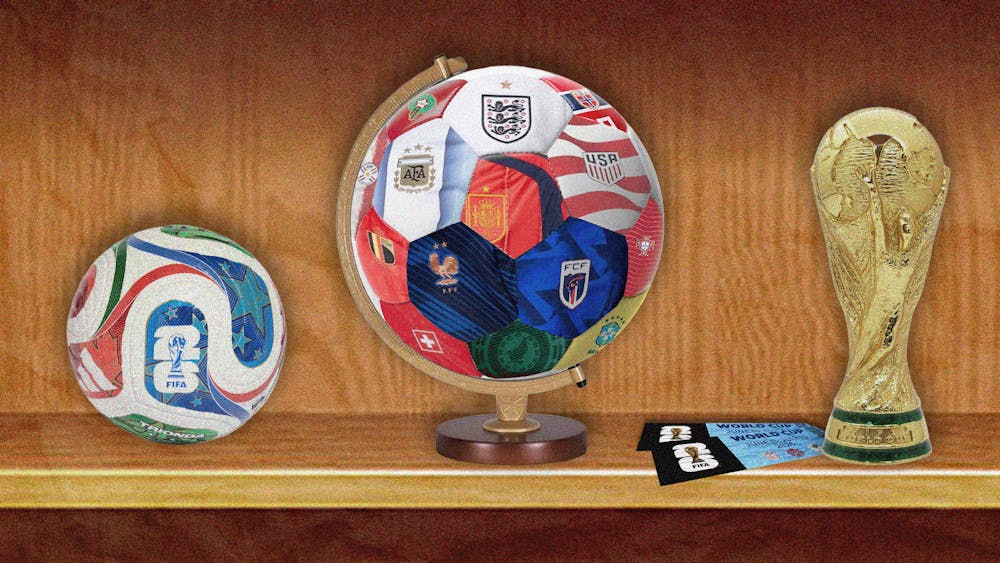
From stadiums across North America to watch parties in restaurants, city squares, and homes around the world, World Cup fans have rejoiced in donning the jerseys that their favored teams sport on the pitch. Some kits, like the “Stars” and “Stripes” of the United States Men’s National Team, make clear nods to the flags that their respective federations unite under. Others are steeped in (perhaps too much) nostalgia—take Argentina’s iconic vertical stripes, now updated with a gradient directly inspired by the blue shades of the team’s winning 1978, 1986, and 2022 jerseys.
Arguably, the best kit designs are those that do a little bit of everything: a well—executed callback, an injection of modern creativity, and a certain je ne sais quoi that evokes enough pride to rouse a nation. It’s a tough line for kit manufacturers to walk every four years, but one well worth the challenge. While the wait for the 2030 World Cup has only just begun, Street is here to help you relive the vibrant 2026 designs that went above and beyond their brief stint on the field.
Cape Verde
The majority of World Cup kit designs can be attributed to one member of a predictable trio: adidas, Puma, or Nike. This year’s tournament is no different, with the three sportswear giants outfitting 37 of the 48 qualifying teams. Cape Verde is not one of them.
Staying true to their underdog name, the Cabo Verde Football Association started a multi-year partnership with fellow breakout star, Capelli Sport, to design their jerseys for the long run. In doing so, they have cultivated a spirit of unity—both between the partners and across the country’s global supporters—that is woven into the (very literal) fabric of the team. Indeed, though the geometric patterns that dance across the team’s home and away kits may seem unassuming at first glance, a closer look at those rippling triangles reveals a subtle, if–you–know–you–know nod to the flight and sailing routes that connect the archipelago’s 10 islands. When taken together with the team’s historic World Cup debut run, there is only one word to describe these uniforms with: sharp.
France
It’s easy to mistake the crisp white polo collars of the 2026 France Men’s National Team as a reflection of preppy fashion’s resurgence or just another French–ism. To do so, however, would be a disservice to the history of polo shirts in the sport. The donning of polo collars by football players in the 19th century was both a practical, readily available choice for the gentleman who took to the pitch and a symbol of their position in the upper class of society. When the French Football Federation began a new partnership with Nike off the heels of Zinedine Zidane’s 2006 headbutt heard around the world and a “dismal” early elimination from the 2010 World Cup, they hoped to re-establish the team’s philosophy of elegance and unity. With the return of the gentlemanly polo collar and addition of a new slogan stitched on the back —“Nos Differences Nous Unissent,” or, our differences unite us—Nike did exactly that. In 2026, with the team’s playerbase being on the receiving end of a wave of racist rhetoric, these design elements take on new meaning: a particularly pointed subversion of the elitist ideals that the polo once upheld.
Haiti
Overlaying imagery on a World Cup jersey is not uncommon. In the 2026 tournament alone, teams have proudly displayed symbols of their heritage, from an Asiatic cheetah head twisting around the torsos of Iranian players to the feathers of the “Eagle of Carthage” making a home on the sleeves of Tunisian jerseys. For the Haiti National Team’s original jersey design, a depiction of the Battle of Vertières, widely recognized as a pivotal moment in the Haitian Revolution, seems a fitting tribute to the country’s history.
The image was later removed from the team’s kits in response to FIFA’s rejection of the design, as its equipment regulations prohibit the use of any “political, religious, or personal messages or slogans” in kit designs. Nonetheless, the rich blues of the revolutionaries, silhouetted by a cool sun, serve as a memorable feat of storytelling for future kit designers to learn from.
Morocco
“Traditional embroidery patterns are reimagined on the collar and cuffs” of the Moroccan home jersey, according to Puma’s description of the bright red kit. Reporting from Al Jazeera expands upon the specifics of these patterns: shapes adopted from the Amazigh, a people indigenous to North Africa.
That the green trim of the unique collar is filled with embroidery inspired by Amazigh tradition is both a testament to the indigenous group’s influence on the region’s craftsmanship and a means of further cementing their ongoing legacy on the global stage. This is done in spite of the oppression that the group is historically victim too. When paired with the Arabic lettering right below that same collar, the kit takes on greater significance as a more vivid, more inclusive picture of modern Morocco.
Norway
Unlike the rest of the jerseys highlighted here, the Norwegian home jersey seems pretty self–explanatory: a faithful rendition of the country’s flag, of course. Perhaps one could excuse Nike if they ended it there, but fortunately, the manufacturer opted to provide us with a little more detail than that. Within the blue stripes that cross through that bold red is a “tonal Urnes‑style graphic” that hearkens back to Norway’s Viking history. The style originates from the elaborately sweeping curved lines sculpted into the wooden doors of the Urnes Stave Church, a UNESCO World Heritage site. For their final touch of innovation, Nike presents us with the product of a successful collaboration with the Norwegian Football Federation: a new typeface. FIFA mandates that player names and numbers be written in Latin characters—Taakeferd, the new font whose name translates to “journey through the fog,” certainly does so, but not without putting its own twist on the rules. Angular and clean, Taakeferd takes inspiration from Elder Futhark runes, bridging the contemporary and the past so that every player can “wear a piece of Norway’s history on their back.”
South Korea
Animals rear their heads once more in the home jerseys of the “Taeguk Warriors.” Tiger stripes emblazon themselves across the team’s signature striking red hues in an ode to the country’s “white tiger, an enduring national symbol of strength and protection,” according to kit designer Nike. The tiger reappears in a more modern, geometric reimagining of its profile on each player’s chest, though it’s the second, hidden tiger head, that truly pulls its weight as the thesis sentence of Nike’s design language for the Korea Men’s National Team 2026 kit collection. Peter Erdahl, who was in charge of designing the uniforms, refers to the slightly artsier graphic stamped on every jersey’s inner collar as representative of the “king of animals” nestled within a bed of the “king of flowers”—the country’s national flower, the mugunghwa. While the juxtaposition of tradition and modernity is woven in everything from the font (where “traditional Korean calligraphy” is merged with “Western design cues”) to the gold detailing (a callback to the collars on the team’s 2004 kits) of these jerseys, it is that concealed graphic that best encapsulates the team’s identity: roaring power, blooming when you least expect it.
Mexico
Last, but well beyond least is Mexico’s gorgeously intricate jersey inspired by traditional Aztec designs, like the Piedra del Sol (the Aztec Sun Stone). These pre–Hispanic designs required authorization from the National Institute of Anthropology and History. The vibrant green is an always welcome feature, particularly alongside the eagle from the nation's coat of arms. From the back of celebrated local Merlín the Duck to fans at just about any game that Mexico didn’t play in, the jersey was hard to miss. Especially interesting was Adidas’ collaboration with Someone Somewhere, through which 150 indigenous artisans embroidered the nation's sleek, black third jersey to be sold online. El Tri’s first jersey is among Adidas’ best selling in history.