Name and Year: Henry Steinberg, Class of 2013
Hometown: Philadelphia, PA
Major: English & Creative Writing
STREET: How did you first get involved with letterpress?
Henry Steinberg: I came to the first Hub meeting at the Kelly Writers House and James LaMarre, who graduated in 2011, did a presentation on the Robinson Letterpress. He was running it at the time. He had started when he was a sophomore. I started working with James in the spring of my freshman year, and I took a book arts and letterpress course that introduced me to all of this stuff. Before that, I just sort of had an idle interest and would sometimes come along when James asked me to do stuff with him. But after that, the ball really got rolling, and over the course of my sophomore year I would go and help him whenever he needed it, and I gradually began to find out that that was me sort of being vetted to take over. So the spring of my sophomore year I found out that I was going to be taking over the press and then I started in the fall of my junior year doing projects. I did like four or five broadsides that fall, and then about the same in the spring.
STREET: What is the printing process like, from the very beginning?
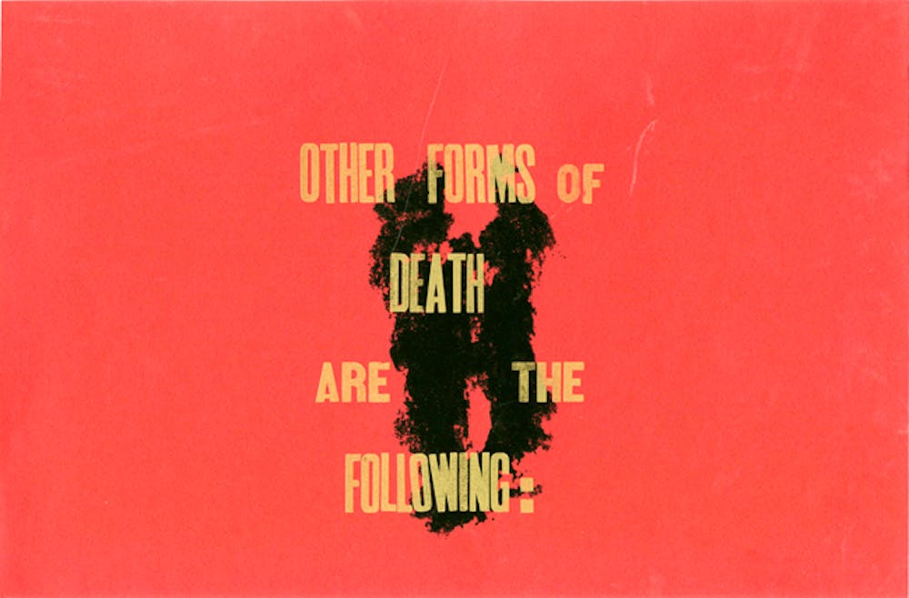
HS: First you pick a text. You figure out what’s going to be the longest line length and you choose your leading, which is the actual piece of lead that the line sits on. In computer typography that’s like the space between the lines, but in printing it’s literally what makes the space between the lines. You get your longest line length, you figure out the dimensions of the page, what size type you’re going to be using, you pick what faces you’re going to use and then you start setting. When you’re setting type, it’s not quite backwards, because the text that you set is going to be a mirror image of what’s on the page, so it’s forward–facing, but when you’re setting it it’s going from left to right, it’s just kind of upside–down. It’s sort of like you’re setting it right to left, with everything as a mirror image. It’s hard to explain; I get a little turned around even when I’m doing it sometimes if I take a break too long in between going in. Then you make your form, which is a text block. You put it onto the press bed, you lock it up, arrange it however you want it to end up on the page, and then you run it through the press. The press is this old machine that has multiple cylinders that carry the ink and transfer the ink onto the type, and then a larger cylinder on which the paper rolls through the press. The pressure from that onto the type forms the distinct impression that you get with letterpress. It transfers the ink and creates the print and then you can just keep repeating that. Now we sort of think of letterpress as this very time–consuming boutique, antique kind of craft thing, but these were machines used for mass–production so they really were the fastest way to do this stuff. For the longest time it took me forever to do a project. I would go in at like 10 in the morning and leave at like six or seven, for a single broadside, not even a complicated thing. But sometimes poets are okay with there being mistakes and typos. There was one on the broadside for poet Paul Legault when he came this year. I sort of had a bit of a dyslexic moment and one of the numbers on it is inverted and I emailed him frantically, asking him, oh my god, is this okay, and he was like, yeah, don’t worry about it.
STREET: There’s kind of a novelty in the materiality of it.
HS: What I really love about this art form is that those errors and inconsistencies and typos, all those sort of incidental things give a sense of materiality to it. It’s literally not a perfectly smooth surface. There’s impressions, there’s a bite. It’s a handcrafted thing so it’s going to have imperfections. I think that’s where a lot of the art comes from.
STREET: What are some of your favorite projects that you’ve worked on?
HS: There was a show in the Arthur Ross gallery last year that was maps of Philadelphia that envisioned some kind of civic change or civic disruption that never happened. So it was like maps of imaginary cities, all Philadelphia. For that, we made a chapbook called Phila Adelphos Irrealialis. There was a call for submissions, to write a piece that used one of those maps as a point of departure, or some other kind of non–implemented city plan to envision a Philadelphia that might have been but never was. I helped to design and print the cover and then the binding for that, and that was a lot of fun. Another project I really enjoyed doing was for the [Kelly Writers House’s] Beltran Prize, with fiction writer Sam Allingham, where I got to design and print an entire edition and do the binding. It was really exciting and very, very time consuming, but ultimately very rewarding. I love making posters for events. I love making just little silly ephemera. I made these bookmarks last year for this other show in the gallery called Handmade Homemade. It was a really quick project; I just blind–embossed the whole thing, which is when you run a piece of paper through the press without any ink and it just leaves a stamp. I made a bunch of those and brought them to the Writers house and everyone sat around, we had some watercolors, some crayons, some other crappy things, and we painted them and colored them and it was this sort of craft, homemade thing. It was this fun, throwaway project but it gives people things to take home.
STREET: Did you have a background in visual art before you got involved in the letterpress?
HS: A little bit. I always drew. My mom was trained as an artist and so was my aunt––both my mom and my dad are architects so I grew up around art. I was always doing some kind of art project or another. I tried doing a little bit of relief printing and linocut printing in high school but I never really got into it. It just never really sparked my interest until I came to college. This sort of weird mix of relief printing but also language—I love poetry and it’s what I’m studying and I’ve always thought letters were really cool. I’ve always liked different kinds of logotype stuff, or when I was in high school I was really embarrassingly into graffiti, but I’ve always just thought that letterforms were really beautiful and interesting and this was a really great way to work with that. Another fun side effect was that whenever I have a block in my own writing it’s always nice to work with someone else’s words. It sort of puts the pressure off of me to do something. I can just do something creative with words that someone else writes, work through that language that’s already there, and it’s been a really great creative outlet in that way. But I’ve always loved art, not that I’ve thought of myself as an artist, but just enjoyed making things. This kind of work falls into an interesting category somewhere between art and craft, the two of which are definitely linked but still separate in their own ways and it’s hard to suss out the difference.
STREET: What kind of interpretative work goes into working with someone else’s text and adding that
visual dimension to it?
HS: The first thing that I’d tell anyone who wants to do typography is read what you’re working with, because ultimately what you want to do is respect the text. If you’re working closely with a writer and they give you permission to do whatever you want to do, then go for it, but ultimately you want to respect the text and you also want to respect the viewing experience. Unless you’re making a strong point, like there’s a lot of very political typography from the 1930s that’s very difficult to read, it’s very hard to understand what’s happening, and there’s a political action happening there, but if you’re just setting a poem, you want to pick a good typeface that’s not too ostentatious, that doesn’t leap off the page, that doesn’t steal the attention from the words. You want to space the words clearly, you want to choose a color that will make sense. Black is always an easy choice, but if it’s not black then have a reason for it to be not black. I tend to set the text very straight; I don’t like to take liberties with how the text itself is arranged, with titles, with author’s names, how you place those on the page to create this dynamic negative space and arrangement. I think that if you put too much stuff on there it needs to be there for a reason, or don’t bother—there’s a lot of bad design that follows that practice, not that I’m an authority on it, it’s just not my cup of tea. You can have some sort of presence on the page, but how I approach it is I don’t want to upstage the writing. And maybe I fail at that sometimes, but ultimately, I want to be true to the author’s words and do right by the reader and I want to make something that’s pleasurable to look at, and if I can balance those three things, then I’ve done a good job.
STREET: How do you see the letterpress work as relating to your own writing?
HS: When I’m writing I tend to think very visually about the page. It’s not just lines set in quatrains or tercets, right–justified. I tend to think of the space of the page as a space to put down sort of maps of meaning. More recently I’ve been thinking very typographically, how letterforms can have or can create meaning, unchained to semantics. It’s helped me think more about letters as units, instead of sort of flowery, descriptive language, in poetry what I like most about the letterpress is that you’re setting something, you’re doing it one letter at a time and it’s very precise. It can lead to some hilarious imprecision, doing it quickly, but it really is a meditative practice. For me, at least, it helps me think about how language is built, the architecture of words and how space is not just sort of a secondary thing. It has presence. It adds dimension to the text when you’re setting it.


