Name and Year: Ellen Amaral, C’14 Hometown: Bermuda Major: Fine Arts Website: www.ellenamaral.com
Street: How’d you first get into graphic design? Ellen Amaral: I took art in middle school and realized I wasn’t very good at it. After that, I knew it was what I wanted to do. It was and still is a challenge. I find that invigorating.
Street: You are (and have been) the design editor and creative director of Penn Appetit. What are some of your design strategies when it comes to representing food? EA: Food is sexy. I used to try to deny it, because it sounded ridiculous, but it’s true. Penn Appetit is high–quality porn at its best, like Playboy in its ‘hey day.’ The writing is smart, and the photography is fantastic. As a designer, I try to showcase them both. Sometimes when I design a layout, I want the reader to be transported to his or her favorite memory of food. Other times, I hope that they put down the magazine and try out a recipe. Then, there are times when I just want somebody to have an orgasm.
Street: What’s it like overseeing and working with a team of designers? EA: Collaboration is key to successful design. The more opinions the better. Without collaboration, your work isn’t going to go anywhere. I tell Penn Appetit designers not to get attached to any of their designs. There are too many designers who limit their work by refusing to explore other ideas, because they’re too invested in their first idea. Sometimes your first idea is the best, but you’ll never know that until you try out 107 other ideas.
Street: Tell us about one of your favorite design assignments. EA: I transformed the lyrics of “Lollipop” by Lil’ Wayne into a typographic booklet. I only used white, black and pink. It made me giggle.
Street: Today, graphic design on the web is just as important as it appears in print, unlike graphic design a couple of decades ago. How do you consider digital platforms when designing things? EA: To be honest, I’m still getting used to digital platforms. I’m a print–design girl at heart. The biggest difference between print and digital design is interactivity. The audience is now part of the design. It’s exciting, but also terrifying.
Street: Your illustrations are very imaginative and almost humorously surreal. How would you describe your illustrative style? EA: My style is slightly perverted. I like to retain the hand–drawn quality of my sketches and then subtly incorporate digital paint. My illustrations are more for adults than children. I made Cinderella’s step–sister into an alcoholic chain–smoker. If that’s wrong, then I don’t know what’s right.
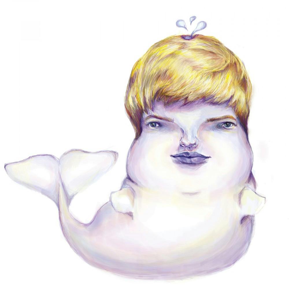
Street: So, we see you did an illustrative composite of a Beluga whale and a classmate. How’d your classmate inspire this one? EA: He was a skinny hipster with Justin Bieber’s hair. I had to make him chubby. He’s the kind of Beluga whale you want to cuddle with, and I’m proud of that.
Street: Who are some of your favorite designers? EA: Paula Scher designed the Citibank logo during the initial client meeting. Her work exudes confidence and intelligence. Girl’s a bad ass bitch.
Street: Where would we find you on a typical day at Penn? EA: I’d probably be at the Starbucks under Commons drinking my fifth coffee of the day. That place is the motherland.
Street: Where do you see your work taking you in the future? EA: I want to work at a design firm and make smart, confident, bad ass design. Or maybe if Disney ever decides to branch out into the perverted world of adulthood, I’ll hit them up for a job.