Good graphic design is magic. It creates space and meaning through the design, the relationship between each letterform, and the structure of area. That’s what PennDesign faculty member David Comberg does: using graphic design, he harnesses its power to generate positive change.
Having trained and worked as a commercial graphic designer after attending Yale School of Art, Comberg realized that working with commercial design was not enough. Since then, he’s grown his talent, transforming them into activism through his own art and involvement in Class Action, a graphic design collective creating visual messages to advocate social change.
“As a graphic designer you need to be conscious and participatory in activism; this is what I teach my students too. If you are not individually active and engaged, and reading the news and following the politics, then you’ll let powers be taken over, which is not a good situation,” Comberg explained. “I think Penn students are a little less active than they could be. One of the things we do here in Fine Arts is really trying encourage people to find their own voice and to express themselves.”

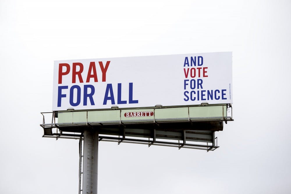
One of his most recent Class Action works is the Vote for Science billboards. Displayed in New Haven, they read “THANK GOD. PRAY FOR ALL. HOPE FOR THE BEST—AND VOTE FOR SCIENCE” in big red and blue capitals calling out from a clean white background. The creation of the three billboards was an idea created by Comberg and four other Class Action fellows to support pro–science candidates in the recent midterms. Appealing to religion and science, it’s a call unifying the two to show that they are not mutually exclusive.
The use of “AND” is emphatic of this idea. “We really struggled over 'and.' We used to have 'but,' and then we were told by some physicians and scientists that we don’t want to separate, we want to include,” Comberg said. “In the end, 'and' was the solution because it’s inclusive. You can be who you are and a still pro–science person.”

The concise, minimalist look makes the distilled message stand out. According to Comberg, they want the color combination of white, red, and blue to connote America and the different typeface sizes to reflect the loud voice of “THANK GOD. PRAY FOR ALL. HOPE FOR THE BEST” and the soft voice of “VOTE FOR SCIENCE.”
Comberg's works have extended far beyond billboards, ranging from minimalist work to flashy and iridescent colors. For example, in 12 books named “Women’s Stories, Testimonies on AIDS,” the spaces were intended to be undesigned. “We were trying to be anonymous in that project and let people speak without getting in their way,” Comberg explained. In contrast, a brochure he designed for PennDesign was intended to be over designed: "Here, we trying to make things cool and funky,” he described.
In his work, his teaching, and his graphic space building, Comberg tries to make a world better. Even if just a little bit, his projects engage audiences in civic dialogues in a way long–worded debates and Facebook posts cannot.