It’s not uncommon for a Penn student to snap a selfie against the bleariness of the post–winter break Locust Walk setting, add a filter, and voila! In an instant, everything pictured has been resurrected from the dead—the drab background becoming a rainbow paradise. Yet while those highly saturated hues add a little more popping yellow to Locust’s shining lanterns or red to the fraternity building’s brickwork, sometimes I think the only things missing from people’s filtered photos in my newsfeed are the flying ponies among cotton candy clouds.
[media-credit name="Gina Decagna" align="alignright" width="300"][/media-credit]
We’re the millennial generation obsessed with iPhone quickies, and to make our surroundings and ourselves just a bit more picturesque for our respective social media viewing audiences, we “up” the colors. The seduction of vibrant colors follows the simple psychology we all learned in 101 lectures: when we see someone blush, that little saturation of pink to the cheeks makes them more attractive. Perhaps our subconscious carnal senses for blood and flesh apply to the aesthetics we’ve grown to desire in art and photography as well. Today, the easy accessibility of photography through iPhones allows us to become artists with imagery to curate, and it’s changing the way we use and see colors on a daily basis.
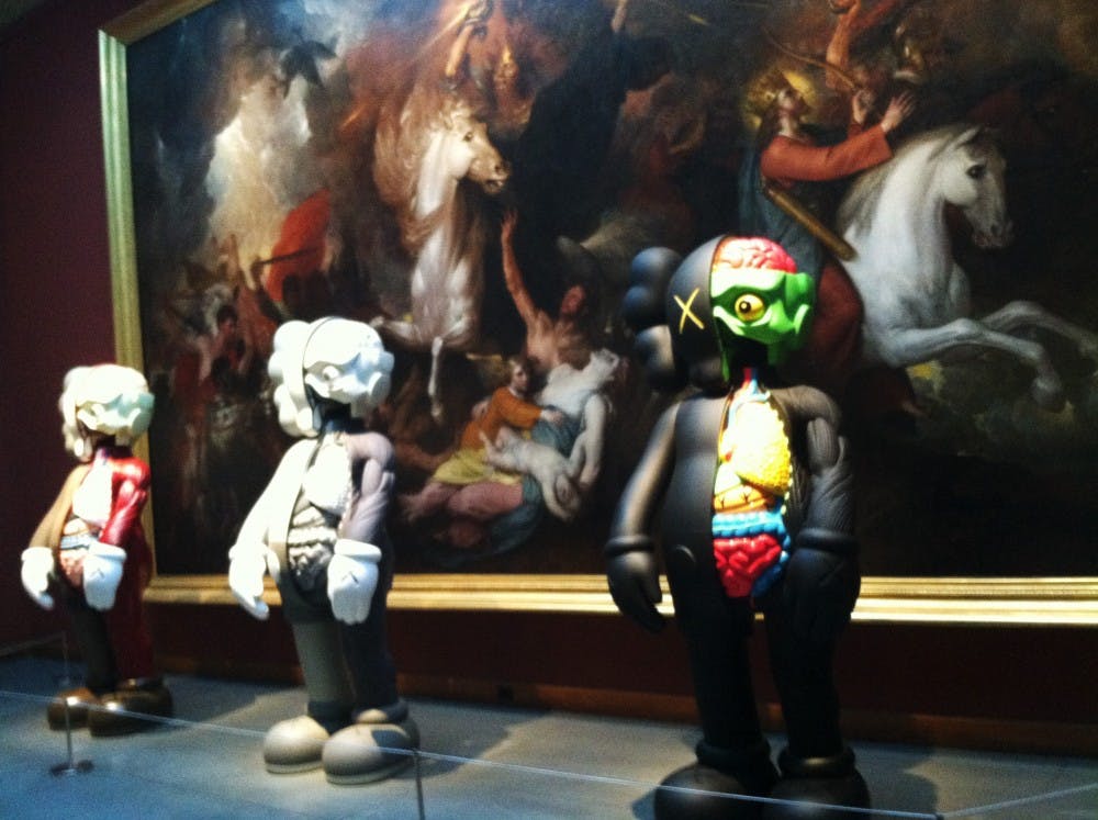
Over winter break, the Pennsylvania Academy of the Fine Arts (PAFA) in Center City held a (now closed) show by former graffiti artist and cartoonist KAWS (real name: Brian Donnelly). His highly saturated, neon–adorned paintings and sculptures were interspersed throughout the institution’s collection of old, historic artworks. Across from Thomas Eakins’ famed “The Gross Clinic” in its bleak blacks and browns and stark whites, stood KAWS’ cartoon–like painting in brilliant greens, yellows and pinks. KAWS infused his artworks with references to pop culture icons, such as the Simpsons and Gumby, and while these creations may not be very different from flashy internet advertisements, it’s noticeable that the trajectory in aesthetics has moved towards favoring these highly saturated, bright colors rather than the muted, darkened palette of the Venetian masters.
The vibrancy of a rainbow palette is whimsically cheery, and there’s no reason we can’t take advantage of fluorescents in addition to cadmiums. However, sometimes we simply overdo it with polychromaticism in our artistic constructions, like dolls who’ve graffitied themselves with tons of gaudy makeup instead of a little mascara. We need to use pops of color sparingly, because natural beauty will always trump fakeness.
